
Tips To Overcome Over plotting of Dense Scatter Plots.
Here are some tricks to overcome overplotting of dense scatter plots
- Use a transparency factor:
# Matplotlib scatter plot with an alpha value
plt.scatter(df[X_COL], df[Y_COL], alpha=0.03)
plt.xlabel(X_COL)
plt.ylabel(Y_COL)
plt.show()
This will introduce some transparency to your visual and the less transparency the denser.

- You can make this even cooler with animated transparency:
# Initialize plot and animation camera
fig, (ax1, ax2) = plt.subplots(1, 2)    # Create 2
camera = Camera(fig)

# Create a sequence of alpha values
alpha_range = np.linspace(0.5, 0, 30) ** 3

# For each alpha value
for alpha_value in alpha_range:
    # Plot "vanilia" plot for reference
    ax1.scatter(df[X_COL], df[Y_COL], color='black')

    # Plot scatter plot with the alpha value
    ax2.scatter(df[X_COL], df[Y_COL], alpha=alpha_value, color='black')

    # Take a "snap" for the animation
    camera.snap()

# Compile and save animation
animation = camera.animate()
animation.save(GIF_PATH)

# Clear figure
plt.clf()
# Display gif
Image(url=GIF_PATH)

- Use color groups and smaller dots:
The DataFrame.plot() docs include the option to pass keyword arguments to the underlying matplotlib plotting method. As you can see, there's an argument s for the dot size. So you should be able to:
# change dots' sizeax = df.plot(kind='scatter', x=x_col, y=y_col, style=['o', 'rx'], s=12)# use diff groups
ax = df.plot.scatter(x="a", y="b", color="DarkBlue", label="Group 1")
df.plot.scatter(x="c", y="d", color="DarkGreen", label="Group 2", ax=ax);
- Take samples of your data:
make sure this won't affect your calculations
#Scatter between energy and popularity
plt.subplots(1,1,figsize=(14.70, 8.27))
ax1 = sb.regplot(data = df_clean.sample(500), x = 'energy', y = 'popularity');
ax1.set_title('Correlation between energy and popularity');
ax1.set_xlabel('energy (Ranges from 0 to 1)');

- Use hexbin function:
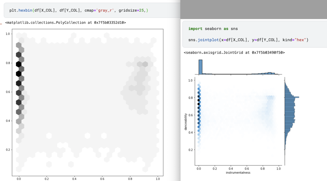
The hexbin() function in pyplot module of matplotlib library is used to make a 2D hexagonal binning plot of points x, y.


Comments
Post a Comment